3 Tips to Make Small Rooms Look Bigger and Brighter

3 Tips to Make Small Rooms Look Bigger and Brighter
Small rooms can be charming, cozy, and full of personality—but they can also feel a little cramped and dim without the right design strategies. The good news? A fresh coat of paint and a few smart color choices can completely transform a space. At Chattanooga Paint & Decorating, we’re here to help you unlock your room’s full potential. Check out these three expert tips to make your small room feel bigger, brighter, and more inviting.
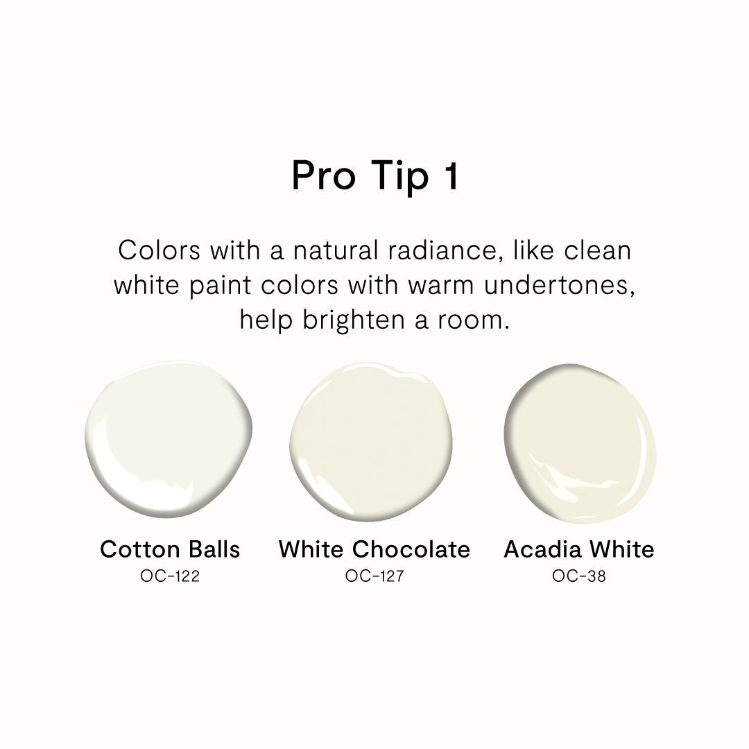
1. Choose Colors with a Natural Radiance
When your goal is to brighten a room, start by selecting paint colors that naturally reflect light. Think soft whites, pale creams, warm beiges, and blush undertones. These shades help to bounce natural and artificial light around the room, making it feel more open and airy.
Pro Tip: Avoid stark whites, which can sometimes feel cold or clinical in small spaces. Instead, opt for warm or slightly tinted whites that add softness while still maximizing brightness. A radiant paint finish—like satin or eggshell—can also enhance light reflection without overwhelming the room with shine.
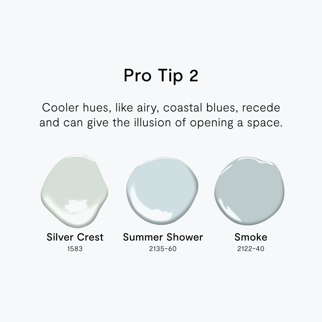
2. Use Receding Color Hues Like Airy, Coastal Blues
Colors don’t just set the mood—they can also influence how we perceive space. Cooler hues, especially light blues, soft greens, and gentle grays, tend to visually recede, giving the illusion that the walls are further away than they actually are. This trick helps small rooms feel more expansive.
Coastal-inspired tones, in particular, evoke openness and calm—think sky blue, seafoam, or a misty gray-blue. These shades are perfect for bedrooms, bathrooms, and other cozy areas where you want to feel relaxed and spacious all at once.
Pro Tip: Pair these colors with crisp white or sandy neutral accents to enhance the breezy, spacious vibe even further.
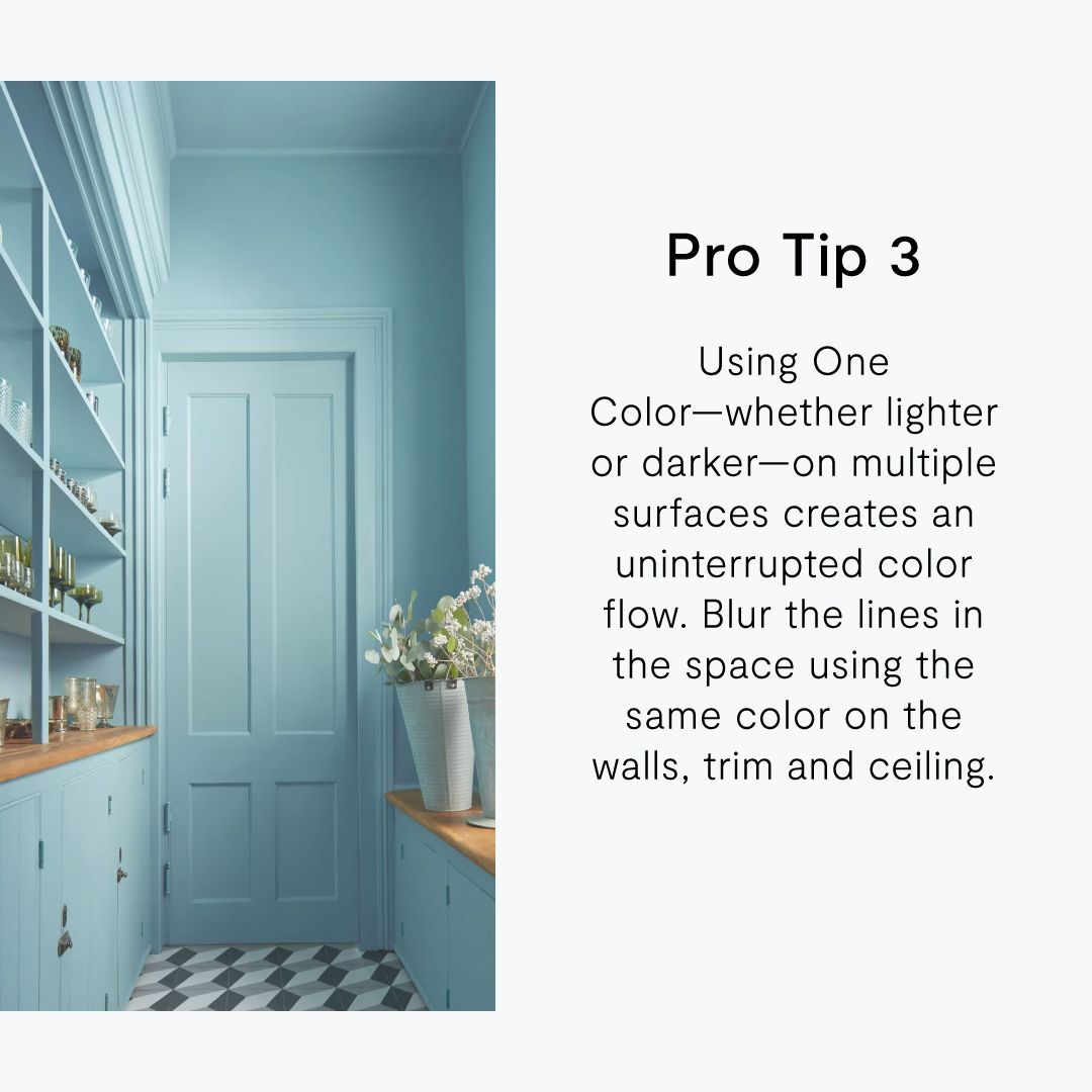
3. Create an Uninterrupted Color Flow
One of the most effective ways to “blur the boundaries” in a small room is to paint the walls, trim, and ceiling in the same color—or very similar shades. This creates an uninterrupted flow, allowing the eye to move smoothly around the space without stopping at contrasting edges. As a result, the room feels more cohesive and expansive.
Whether you choose a soft light color or even a rich, moody tone, keeping it consistent across surfaces reduces visual fragmentation. In essence, this technique minimizes sharp breaks in the design and maximizes the illusion of height and openness.
Pro Tip: This strategy works especially well in rooms with architectural quirks, such as sloped ceilings or awkward angles. A unified color palette helps those features blend in rather than stand out.
Let’s Transform Your Space
At Chattanooga Paint & Decorating, we believe that great design starts with the perfect paint. Whether you’re looking for expert color matching, premium paint products, or a little inspiration, our team is here to help. Visit our showroom or contact us today to bring your small room to life—with style, light, and plenty of visual space.